Church Annual Report Design: A Complete Guide for 2026
A step-by-step guide to church annual report design. Learn to plan, gather data, and create a report that shares financial clarity and ministry impact.
January hits, and the annual report moves from “we should really do that” to “we have to get this out soon.” The pastor wants something encouraging. The finance committee wants the numbers right. Ministry leaders still haven't sent their updates. Photos are scattered across phones, inboxes, and social posts. The spreadsheet in front of you is accurate, but it doesn't explain much to the average reader.
That's why so many church annual reports end up disappointing everyone. Some read like a condensed audit package. They're technically responsible, but almost nobody finishes them. Others look polished and upbeat, yet they leave careful readers wondering what happened with the money.
Good church annual report design solves that tension. It doesn't choose between story and stewardship. It connects them.
The reports that work best don't try to say everything. They show what God did through the church, who was served, where the ministry moved forward, and how leadership handled resources. They make the congregation feel informed rather than managed. They give donors confidence without turning the report into a finance lecture.
Beyond the Numbers A New Vision for Your Annual Report
A church annual report usually breaks down at the point where ministry language and financial language stop talking to each other.
I see it happen all the time. The front half celebrates baptisms, volunteer effort, outreach, and answered prayer. The back half turns into a finance packet with fund balances, expense categories, and reserve figures that only a few readers can interpret. Both parts may be accurate. Together, they still fail if members cannot see how the money supported the ministry they just read about.
That is the shift many churches need. Annual report design is not mainly about making the document look polished. It is about joining story and stewardship so the congregation can follow the full picture with confidence.
The strongest reports work as a ministry summary, a trust document, and a clear explanation of fund-based finances. They show what happened, who was served, what resources were used, and why leadership made the choices it did. If your church tracks designated giving, restricted funds, building projects, benevolence, or missions separately, the report should make that plain in normal language rather than hiding it inside accounting terms.
Why many reports fall flat
Three patterns show up repeatedly.
-
The finance appendix problem
Financial statements get dropped in at the end with little explanation. Members see totals, but they do not know which numbers reflect general operations, designated funds, or one-time projects. That creates confusion, especially in churches with several active funds. -
The ministry scrapbook problem
The report reads warmly and looks attractive, but the stewardship side is too thin. Readers may enjoy the stories and still walk away unsure whether giving was managed carefully. -
The submission lottery problem
The ministries that answer emails get featured. The ministries led by faithful but overextended volunteers disappear. That skews the report and usually understates the year.
Practical rule: A good report lets a church member answer two questions without effort. What ministry happened, and how were resources stewarded?
A better standard
A useful annual report answers a small set of plain questions well.
| Question readers ask | What the report should show |
|---|---|
| What happened this year? | Clear ministry highlights, progress, and key milestones |
| Who was impacted? | Real stories, selected photos, and a few meaningful activity indicators |
| What happened financially? | A concise explanation of income, expenses, fund activity, and ministry allocation |
| Why should I trust this? | Clear structure, understandable fund reporting, and visible accountability |
That last question deserves more attention than churches usually give it.
Trust rarely grows from volume. It grows from clarity. A congregation does not need every internal spreadsheet, but it does need enough explanation to understand how unrestricted giving supported the general budget, how designated gifts were handled, and whether major initiatives stayed within the church's stated priorities.
Good design helps, but only after the church has decided what it wants to make clear. The same discipline used in crafting effective design briefs applies here. Define the goal, the audience, the required content, and the limits before anyone starts arranging pages.
The reports people keep, reread, and share are the ones that treat financial transparency as part of the story, not a technical add-on. That is what builds confidence.
Planning Your Report with Purpose and a Timeline
The annual meeting is three weeks away. The treasurer has numbers in a spreadsheet, two ministry leaders still have not sent their summaries, someone wants a printed booklet, and the senior pastor asks if the report can feel more inspiring this year.
That situation is usually a planning failure, not a design failure.
Start with one dominant purpose
Before anyone chooses fonts or page layouts, decide what this report must accomplish for the congregation.
For many churches, the primary goal should be trust. That means showing ministry fruit and showing financial stewardship with enough fund-level clarity that readers can follow what happened. A church that blends designated gifts, general budget activity, and capital campaign updates into one vague summary may still produce a nice-looking report, but it does not answer the questions members actually have.
A report can celebrate volunteers, highlight milestones, and support donor communication. One purpose still has to lead. If trust leads, the writing gets sharper, the financial section gets clearer, and the design choices become easier to judge.
A simple test helps. If a member reads the report and still cannot tell how unrestricted giving supported ministry versus how designated funds were handled, the report missed a central job. For churches refining that financial explanation, this guide to a church financial report that members can actually understand is a useful reference point.
Define the decisions before the design work starts
I have seen churches lose a week because the pastor wanted a testimony-driven report, the finance team wanted a detailed budget summary, and the communications volunteer was designing for social media pages instead of a printable document.
Write down the decisions first:
- Primary audience. Members, donors, ministry leaders, or all three
- Primary purpose. Trust, celebration, accountability, or a year-in-review summary
- Final format. Print, digital PDF, web page, or hybrid
- Required content. Letter, ministry highlights, financial summary, fund explanations, volunteer thanks, next-year priorities
- Approval path. Who reviews content, who verifies numbers, who gives final sign-off
This is the same discipline used in crafting effective design briefs. Good briefs prevent vague requests later. They also protect the person assembling the report from endless revisions driven by preferences instead of purpose.
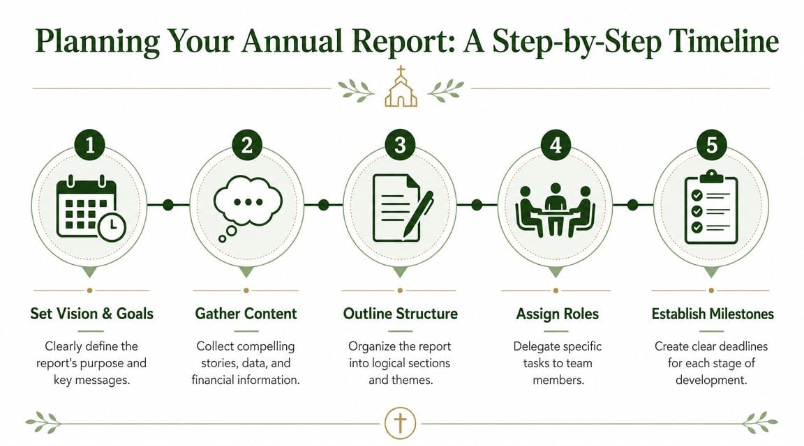
Build the timeline backward from the release date
Set the date the congregation will first see the report. Then work backward.
Churches often underestimate how long review takes once finance wording is involved. A ministry paragraph can be edited in minutes. A sentence about reserves, designated gifts, or year-end surplus may need review from the treasurer, executive pastor, and senior pastor before anyone is comfortable publishing it.
A workable schedule usually looks like this:
-
Release date
Tie it to the annual meeting, members' meeting, or a key Sunday when attendance is strong. -
Final approval deadline
Leave time for leadership review and final number checks. -
Design and revision window
Protect calendar space for layout, photo selection, and copy fitting. -
Content due date
Set this earlier than people think is necessary. It rarely arrives complete on the first round. -
Finance close and summary draft
Decide when year-end numbers will be stable enough to summarize accurately. -
Follow-up week
Assign one person to chase missing submissions. If that role is vague, the delay lands on the church administrator at the worst point in the process.
Plan for the real bottleneck
The bottleneck is usually not design software. It is late content from busy ministry leaders and late clarification from finance.
Expect that. Build for it.
Give ministry leaders firm deadlines, short submission forms, and examples of what good input looks like. Give the finance reviewer a defined scope too. Ask for a reader-friendly summary of income, expenses, major fund activity, and any restricted or designated balances that need explanation. That keeps the report aligned with how the church accounts for money, instead of reducing stewardship to a few broad categories that raise more questions than they answer.
Keep the team small and the roles clear
One coordinator should own the schedule. Four or five editors should not all rewrite the same page.
A practical team usually includes:
- Report coordinator who manages deadlines and compiles submissions
- Finance reviewer who confirms accuracy and plain-language wording
- Design owner who handles layout and visual consistency
- Final approver who signs off on both tone and content
Small teams move faster. Clear roles reduce confusion. That matters because a church annual report is not just a recap document. It is a trust document, and trust gets built when the story and the stewardship details agree with each other.
Gathering Your Stories and Financial Data
Annual reports either become persuasive or stay flat, a distinction often determined by internal processes. Churches usually have enough ministry activity to fill a report. What they often lack is a disciplined way to gather usable stories and clean, understandable financial information.
Church reporting guidance consistently points to the same pattern. The strongest reports blend ministry stories, photos, and key statistics with a concise financial overview, rather than burying readers in raw detail, as noted in this Aplos guide to church annual reports.
Ask ministry leaders for outcomes, not recaps
If you email ministry leaders, “Send me a paragraph for the annual report,” you'll get one of two things. You'll either get nothing, or you'll get a calendar recap that doesn't belong in print.
Ask narrower questions instead.
Try prompts like these:
- What changed in people's lives because of this ministry?
- What moment from the year best represents your ministry's purpose?
- What challenge did your team face, and how did God provide?
- What should the congregation thank God for specifically?
That changes the tone immediately. Leaders stop listing events and start describing impact.
Create a simple submission template
Ministries submit better material when the format is obvious.
Use a one-page request that includes:
| Needed item | What to request |
|---|---|
| Story summary | A short paragraph focused on people, not schedule |
| Names | Confirm spelling and preferred title |
| Photos | A few strong images with context |
| Metrics | Only the most meaningful indicators |
| Quote or reflection | A brief comment from a leader, volunteer, or participant |
For volunteer-heavy ministries, even outside examples of structured reporting can help spark better inputs. Resources on church volunteer reports can give ministry leaders a clearer sense of what organized reporting looks like when teams need to summarize service activity in a useful format.
Don't let photos be an afterthought
Weak photos make even a strong report feel generic. Use images that show ministry in action, not just staged groups smiling at the camera.
A photo earns its place when it answers at least one question:
- Who is this ministry serving?
- What is happening here?
- Why does this moment matter?
Captions matter too. A caption shouldn't just identify the event. It should connect the moment to ministry purpose.
A strong caption gives a photo meaning. A weak caption just proves the event happened.
Financial data needs translation, not dilution
Church annual reports frequently lead to a loss of reader confidence. They either include too much and overwhelm everyone, or they simplify so aggressively that important realities disappear.
The hardest part is usually restricted funds. A general summary may look neat on a page, but it can blur the difference between unrestricted operating money and designated giving. That leaves careful readers with questions the report should have anticipated.
A better approach is layered reporting. Keep the annual report concise, but don't pretend all money behaves the same way. Distinguish broad operating results from fund-specific accountability. If a gift was restricted, readers should understand that leadership treated it accordingly.
An abbreviated presentation can still be transparent if the logic is clear. One practical church-finance perspective recommends dashboard-style charts and abbreviated statements, which highlights the primary challenge: choosing the right level of detail for each audience, as explained in this church annual report resource from Smart Church Solutions.
Use a narrative and audit trail together
Here's a practical structure that works well:
-
Front of report
Ministry highlights, selected milestones, visible signs of impact -
Middle of report
High-level stewardship summary tied to ministry priorities -
Back or linked appendix
More complete fund activity, statements, or policy notes for readers who want depth
That layered model respects both kinds of readers. Some want the big picture. Others need to verify stewardship.
For churches trying to present that clearly, it helps to think in terms of fund reporting rather than generic bookkeeping. This explanation of church financial reporting is useful because it frames reporting around how churches manage restricted and ministry-specific funds, not just around standard business categories.
Designing for Clarity and Congregational Impact
Good design reduces effort for the reader. Bad design asks the congregation to work too hard.
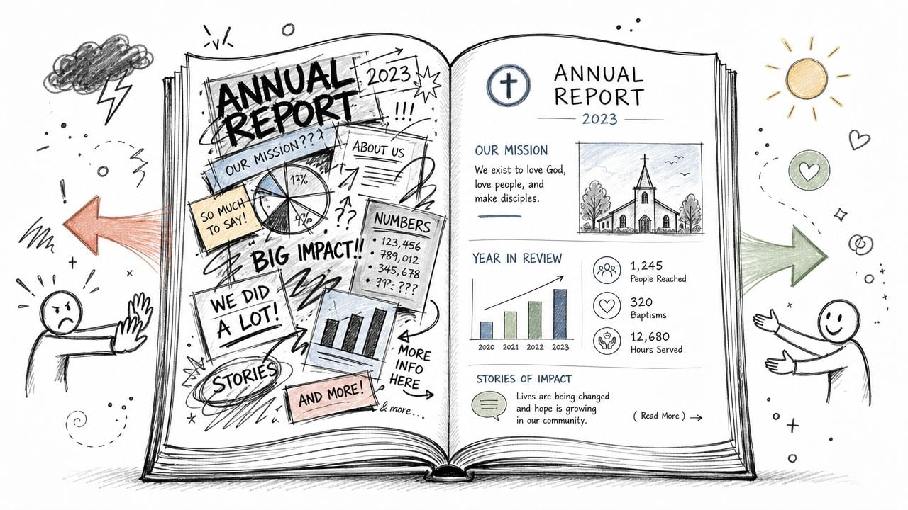
Church annual report design doesn't need to be flashy. It needs to be readable. That means clear headings, consistent spacing, restrained color choices, and enough white space that people don't feel ambushed by the page.
Guidance aimed at church readers recommends keeping financial reporting to top-level information, limiting total data points to 10 or fewer, using graphs and charts to carry the narrative, and avoiding pie charts with more than 5 segments because they become hard to read, according to ChurchTrac's annual report design guidance.
Build visual hierarchy first
Most annual reports fail visually because everything looks equally important.
Fix that with hierarchy:
- Primary headline for the main point of the page
- Secondary subhead for context
- Short body copy for explanation
- Caption or callout for details
If every page has three fonts, five accent colors, and dense copy blocks, people skim without retaining anything. A restrained system almost always looks more credible than an ambitious one.
Show financial meaning, not just financial categories
A common mistake is placing a compressed spreadsheet into the report and calling it a design decision. It isn't. It's just a table that escaped review.
Better choices include:
| Don't use | Use instead |
|---|---|
| Dense account listings | Grouped ministry categories |
| Overloaded pie charts | Simple bar or column charts |
| Tiny footnotes for key context | Short explanatory labels beside the chart |
| Full statement formatting | Dashboard summaries with optional deeper access |
If you need to show how multiple funds operated, use side-by-side bars or a small dashboard. Readers compare length much more easily than they compare wedge sizes in a crowded pie chart.
For the cover and opening spread, it can also help to borrow a few principles from publishing. These powerful book cover design tips are useful because they emphasize focal point, typography, and visual promise, which is exactly what the front page of an annual report needs to establish.
Make the report feel alive
Photography should support the story, not decorate it. Use full-width ministry imagery sparingly. Then balance it with quieter pages that let data and text breathe.
Video works best in digital versions when it extends the report rather than repeating it. A short ministry recap or pastoral reflection can deepen engagement without bloating the page count.
A good example of visual pacing is below.
A practical layout test
Before approving a page, ask three questions:
- Can a member understand this page in a quick glance?
- Is the main point visually obvious before they read every sentence?
- Would this still make sense if read on a phone or printed in grayscale?
Layout check: If the chart needs a spoken explanation to make sense, redesign the chart.
That test catches most readability problems before they reach the congregation.
Choosing Your Format Print Digital or a Hybrid Approach
Format decisions affect the whole project. They shape your budget, page count, proofreading workflow, and how much depth you can reasonably include.
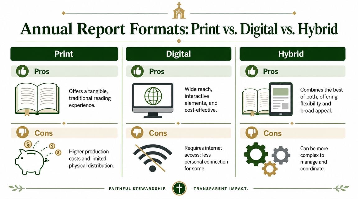
Church communications guidance treats this as an early planning decision, not an afterthought. Planners are advised to decide on print, digital, or hybrid before design starts, then account for page count, paper quality, postage, storyboarding, and multiple proofreading rounds as part of a repeatable production process, as described in this church annual report production guide.
Print still matters
Printed reports have obvious strengths. They feel substantial. They work well for annual meetings, older members, donors, and welcome desks. They also force discipline because page limits expose weak content quickly.
But print creates hard constraints:
- Production choices matter because paper, cover stock, and color decisions affect cost and readability.
- Late edits hurt more once files are prepared for press.
- Distribution takes planning if copies will be mailed or handed out across multiple services.
Digital gives you room
Digital reports are easier to share by email, website, and social channels. They also make layered reporting easier. You can keep the main report concise and link to fuller financial statements, ministry videos, or board-approved supporting material.
That flexibility is one reason many churches are rethinking how they present stewardship. A digital-first approach makes it easier to separate summary storytelling from detailed accountability. For churches managing multiple designated funds, that's often a better fit than squeezing everything into one booklet. If you're evaluating systems that support that kind of visibility, this guide to fund reporting software is a useful reference point.
Hybrid is the practical default for many churches
For many congregations, the best choice isn't either-or. It's both, on purpose.
A simple comparison makes the trade-offs clearer:
| Format | Best for | Main drawback |
|---|---|---|
| In-person distribution and tangible reading | Higher production effort | |
| Digital | Broad sharing and layered content | Some members won't engage online |
| Hybrid | Mixed demographics and public sharing | Requires tighter coordination |
Hybrid works when the church designs one core report and adapts it for two contexts. The printed version stays concise and readable. The digital version adds links, embedded media, or expanded financial access for readers who want more.
The key is deciding that upfront. A rushed attempt to “also make it digital” at the end usually creates duplicate work and inconsistent formatting.
Your Final Production Checklist and Distribution Plan
The last stretch decides whether the report feels polished or patched together. At this point, details matter most. A misspelled name, inconsistent number, weak export, or quiet release can undercut weeks of work.
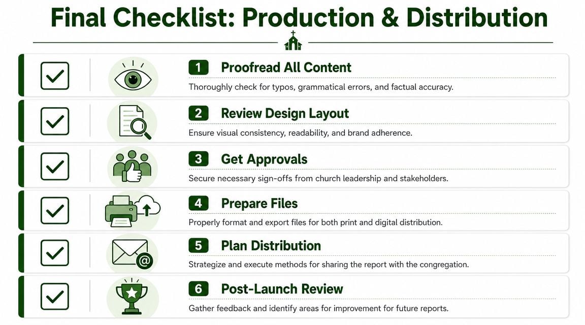
Run a real pre-release review
Don't rely on the people who built the report to catch final mistakes. They're too close to it.
Use a final checklist that includes:
-
Name verification
Confirm spelling for staff, volunteers, missionaries, donors, and ministry participants mentioned by name. -
Numerical consistency
Check that charts, captions, and summary paragraphs match the approved financial source material. -
Photo permissions and appropriateness
Make sure images fit your church's standards and any child-safety policies. -
Format testing
Open the PDF on a phone, tablet, and desktop. If printed, review a physical proof rather than trusting screen color. -
Leadership approval
The pastor, finance reviewer, and any final approver should sign off on content before distribution begins.
Read the report once for meaning, once for typos, and once for numbers. Those are three different review passes.
Plan the release like an event
A church annual report shouldn't just appear in a resource folder and hope for clicks. If you want people to read it, give it a moment.
A practical rollout often includes:
-
Sunday mention from the platform
A brief verbal summary from the pastor or board chair gives the report weight. -
Email to members and givers
Keep the email short. Highlight a few major takeaways and link directly to the report. -
Printed copies in visible places
Welcome desk, church office, annual meeting packet, and leadership gatherings all work well. -
Short social snippets
Pull one chart, one photo, and one ministry highlight into simple posts. If your team needs help thinking through channels and consistency, this guide on social media for church offers a useful framework for getting church communications seen.
Learn from the release
The last job isn't distribution. It's review.
Ask a few trusted readers what they understood quickly, what confused them, and what they wanted more of. You don't need a formal research study. You need honest reactions from members, leaders, and a few non-finance readers.
Use those responses to improve the intake process for next year. Save approved charts, copy blocks, ministry prompts, and templates in one shared folder. Churches that improve fastest don't reinvent the whole thing annually. They refine a system.
A report becomes stronger when the church treats it as a recurring stewardship practice rather than a once-a-year creative scramble.
If your church wants annual reports that are easier to build and much clearer to explain, Grain is the accounting solution I'd recommend. It's purpose-built for churches, with true fund-based accounting that helps finance teams present restricted and designated funds clearly, accurately, and in a way pastors, boards, and congregations can follow.
Ready to simplify your church finances?
Start free with church fund accounting, or watch a product demo first.